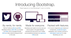
I am currently working on a Rails app and was tired of looking at the default styling as I build it out … so I sat down to give it some Twitter Bootstrap style. To give  the app some css love, I added twitter  bootstrap to my Gemfile and ran bundle install. It took me roughly four days of playing around to get a really good feel for the power of Bootstrap.
What follows is a quick overview of what may help you get started with Bootstrap as well:
ADDING BOOTSTRAP TO YOUR RAILS APP
Add to your Gemfile:
gem 'bootstrap-sass', '2.1'
Run “bundle install”
$ bundle install
The purpose of Gemfile is it serves as reference to Rails on what dependencies/gems the app needs. Specifying it in Gemfile makes it available.
THE STYLES
Be sure to import the Boostrap styles into your application.css file. If you have a custom  SASS stylesheet, be sure to include this:
// Use Twitter Bootstrap
@import "bootstrap";
@import "bootstrap-responsive";
Bootstrap does not automatically call the responsive styles so be sure to add that last line.
THE Bootstrap GRID RULES!!
The amazing simple-complexity, beauty and methodology of Bootstrap is in it’s Grid. The default Bootstrap grid system uses 12 columns, adding up to a 940px wide bounding container. If you choose to require the responsiveness features of bootstrap, the grid adapts to anywhere from 724px to 1170px widths. Below 767px, the columns fluidly stack vertically, the menus minimize. The size of the viewport dictates the behavior of elements.
Each of the 12 columns are 70px wide with 30px gutters each. Thera are fluid classes for both rows and containers and classes you can use depending on the number of rows and columns your layout requires.
RESPONSIVENESS
Bootstrap does not enable responsiveness by default so you need to do a few things first
Download or call bootstrap-responsive.css into your styles and include this code in the head of your document:
<meta name="viewport" content="width=device-width, initial-scale=1.0" />
There are a few more steps, but those are necessary steps to begin.
MEDIA QUERIES
The media queries that Bootstrap offers will modify the width of the grid columns, it will stack elements removing floats where necessary and will fiddle with heading and text size to make it readable on a number of devices.
/* Large desktop */ @media (min-width: 1200px) { ... }

/* Portrait tablet to landscape and desktop */ @media (min-width: 768px) and (max-width: 979px) { ... }

/* Landscape phone to portrait tablet */ @media (max-width: 767px) { ... }

/* Landscape phones and down */ @media (max-width: 480px) { ... }
To deal with browsers that do not support CSS3 media queries, namely IE 8 and below, there is a nice IE shim to include in the head of your document and you can use respond.js to add media query support to IE:
<!--[if lt IE 9]> <script src="http://css3-mediaqueries-js.googlecode.com/svn/trunk/css3-mediaqueries.js"></script> <![endif]-->
I began styling elements using the Components library.
In conclusion, in a few days, I was able to dig into the basics of Boostrap. I encourage you to play around, you may actually have fun! I know I did — and will continue to do so! 🙂


